Tuesday 23 December 2014

Locating | Cliff Briggie

I started a Pinterest board in order to get my ideas together for the Locating unit.

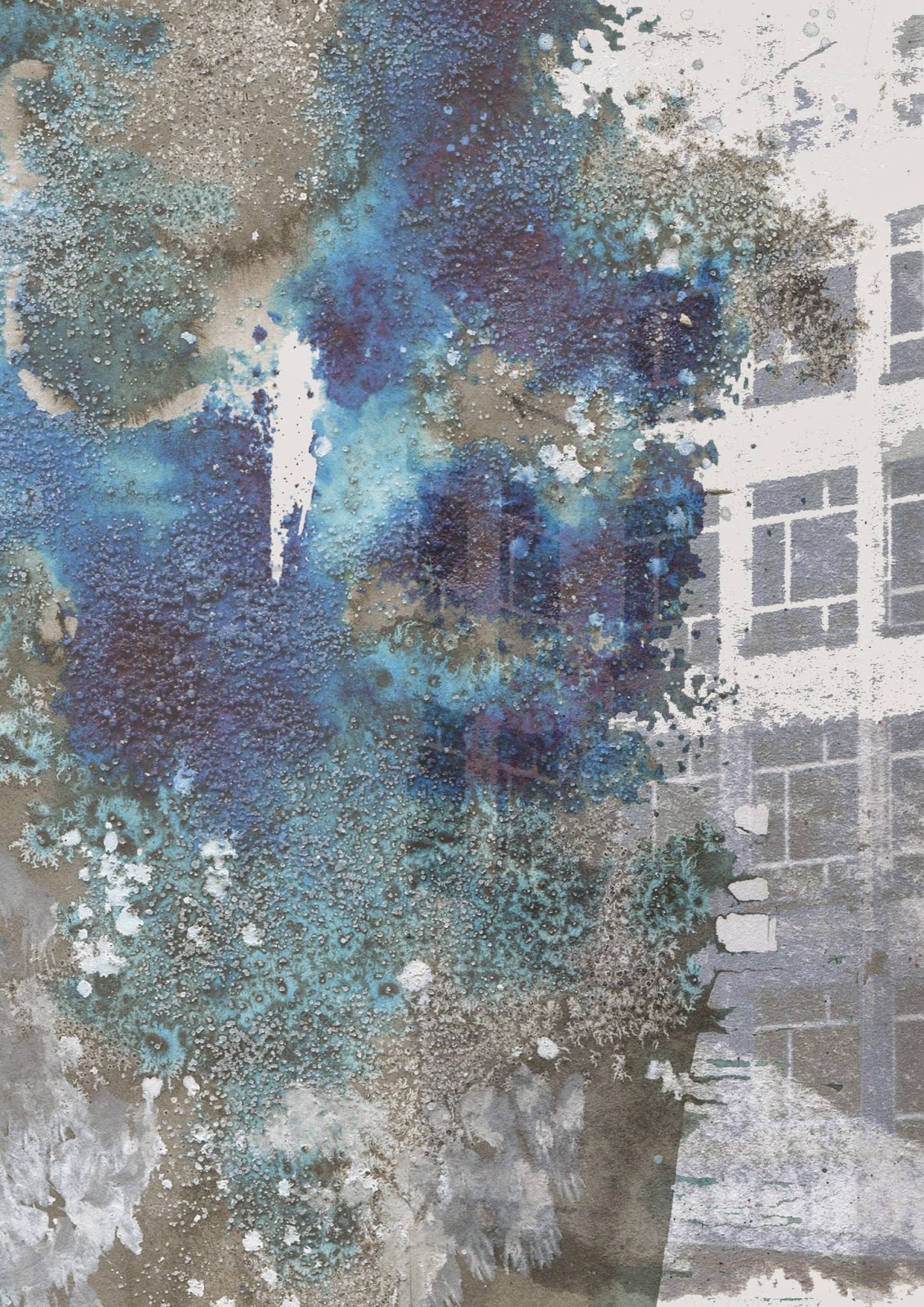
While researching on Pinterest I stumbled across an artist I'd never heard of before, Cliff Briggie.
His work instantly drew my eye as it is very unique and mesmerizing. Some of his works look like moving smoke, splattered paint or stirred water. I have developed a real admiration for his work and will no doubt be taking inspiration from his pieces.


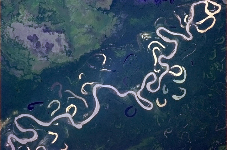
Although I haven't photographed moving water directly I did photograph inks merging through the perspective of an over head projector. 
Briggie's work has inspired me to look more into water and the blending of colours, as they create an unpredictable and delicate outcome similar to that of the colours in an iris. I have bought some marbling inks to play around with and see what I can create. I really like the fact that the results will be volatile and uncontrollable to a certain extent. I usually have a lot of control over my drawing so this will be something for me to experiment with.

Wednesday 10 December 2014

Locating | Self Initiated Brief

This is the first time that I have ever had to create my own brief for a project before, and although it is really exciting it is also a little daunting. However, I splashed around with a couple of ideas and decided on working with the title 'eye of the behholder'.


Brainstorming ideas lead me to begin with drawing and trying to imitate the appearence of the iris. This part of the eye is fascinating especially in terms of colour. I didn't realise quite how strange an iris was until I really payed it some attention.
I thought I'd start the unit as I intend to go on by getting straight out of my comfort zone. We learned a drawing technique last year in which you place a glass bowl over a projector and drop ink down the sides. It creates a really nice effect which resembles an eye. Normally in the first couple of weeks of a project I stay in my sketchbook when it comes to drawing, this helped me break up my routine and get the ball rolling.


Friday 21 November 2014

Intentions | Unit Evaluation

The Intentions Unit has been a huge eye-opener for me in terms of the purpose of my work. I have taken a lot of time and done a lot of research on where exactly I see my work going. For the first time I have been making decisions based on the research I have done on fashion and have taken inspiration from real designers that are already out there. Making Inspiration, Consumer and Concept boards has really helped me get my head around what I am doing and where it is going. I have made myself much more aware of what I need to be producing to target the right audience, which I hope will benefit me a lot for the rest of this year and Level 6.


I have also tried to link everything together in terms of concept. I often find it easy to get lost and stray from my original ideas into something completely unrelated. I have tried hard to back everything up and link it throughout. Although I did start with windows and stray from that into textures which in the end took over a little, I see that more as development because I became stuck with the windows concept by itself. In terms of linking my work to contextual practice, I think I have tried to find artists/designers/photographers along the way that relate to what I am doing and why I am doing it. However, I definitely could have had a few more just to make it crystal clear where all of my ideas are coming from. I've learned that I need to document this from the start so that I don't get confused trying to place them later.
When I first think about the Unit and the new processes I have tried, I feel like I haven't experimented anywhere near enough. However I then think about the fact that I have really come to terms with which processes and media work for me. I have really dedicated this unit to progressing digitally, and I have realised this is what I enjoy the most and it plays to my strengths. In a way I have learned countless Photoshop processes which I have documented in a technical file, but aren't as obvious to see when just looking at my work. Nonetheless, I feel like I should have taken a lot more risks with my drawings beforehand, as the only overtly new process I tried was paper making. In comparison to Level 4 my drawings are a lot more thought about and considered, rather than drawing for the sake of drawing.


 The one thing I would say I have done the most successfully in this unit is refining and fixing. Although I didn't take as many risks as I would have liked to I certainly made enough mistakes. I kept stepping back and thinking "Ok, what's wrong and how am I going to fix it". Mind mapping helped me a lot along with asking other people for their opinions. I learned that to be able to criticise yourself its important to be able to take criticism from other people and work on it accordingly. Overall, this unit has been a learning curve for me. I can feel myself becoming more prepared for the outside world and understanding what it will want from me. The key process for me has been refining again and again and finding solutions to what needs fixing in order to produce the best possible outcome.


Tuesday 18 November 2014

Intentions | Consumer

The whole way through this unit I thought that my work was aimed at high street stores like Topshop, River Island, Urban Outfitters etc. Now that I have my collection and it has been refined several times, it looks more like the higher end of high street. For example Whistles, Cos, Reiss, Zara or & Other Stories.
Although my designs are still classified as high street the consumer will be a lot different than it was previously. It is more likely to be someone with more money to spend at their leisure and someone a little less grungy than I thought before. My prints themselves have a grungy feel to them but because of the processes I've put them through, the garments I have chosen to put them on and the fabrics I have printed them on they have become more polished.


I have digitally printed my final collection on a thin silk Habotai and an optic Cotton. I chose which print should go on which fabric based on what it is used for on the final designs. I spent some time in the studio today pinning onto a mannequin to see what the garments might look like physically, seeing how they might drape etc. Overall I am really satisfied, however there were two prints which I feel should be in different fabric.
I sent these off to be printed in the more expensive silk Crep de Chine that I used previously in the project. I thought that this would be too expensive for the audience I am going for but now that I am aiming for higher end high street the price is less of an issue. 


Pinning my designs onto a mannequin has really helped me to visualise what my prints would looks like as actual products, and I am happy with what I have produced for this unit.

Monday 10 November 2014

Intentions | Addition of lines and grids

I finally put together my final collection this week based on the most popular designs from the tallys, however when I looked at it all together I just wasn't happy. I like all of the individual designs but when they are put together I'm not seeing a collection that fits together well. This has made me realise that the fashion illustrations and seeing the prints on the product is extremely important, as they can look so different. Thankfully I still have time to make improvements to the prints, so I mind mapped what I thought was wrong so that I can fix the issues. 

I needed some inspiration on what to do so I went on WGSN to look and the Print and Pattern trend forecasts. I noticed a lot of stripes for S/S15. I took inspiration from this and added lines to some of the prints I have already rather than creating all new ones.
I found the most popular design previously was the dress with a white grid pattern over the top of the print, I thought that this might be because the white space creates more of a pattern. I tried experimenting with grids too as it proved popular with my audience.

I feel like the newly added lines break up my designs and make them less similar. Looking at the improved collection, I am much happier with it. It looks a lot more refined and thought about, and each print now is individual to all the rest while at the same time fitting together well as a collection.


Tuesday 4 November 2014

Intentions | Fashion Illustrations

In order to start putting together a final collection of garments I needed to create my own fashion illustrations to photoshop them into, and make sure they are keeping in with my theme.
I see my collection is being grungy, which fits in with the original theme of 'Urban Influences'. I took to Pinterest again to research before creating my sketches, making a collection of fashion illustrations and mood boards to take inspiration from [Illustrations/moodboards]. I also did this to get ideas of how I might present my final designs when it comes to doing so. 

After tracing the garment shapes I wanted I then edited them by drawing in what I wanted to change.
The hair and shoes were the main things that needed changing, as well of a couple of arms and legs in a different position. On Pinterest I found that Grunge shoes were chunky and simple, and grunge hair was messy and undone with minimal styling if any. These are the ideas I want to portray however I also want to keep the idea that a certain amount of effort has been made too. I played around freehand with these ideas until I was happy with my sketches. The shading/scribbles links to my grunge theme and makes the sketches more my own. Here are the final designs:


Photoshopping my prints onto my sketches has gotten me really excited, I can finally see a collection coming together.
My plan is to create a couple of designs on each garment to begin with. To narrow it down to a final collection, I am debating asking people around the studio and making a tally chart of people's favourites, then using the results to pick my final garments. I want to be working towards a high street audience in particular young adults, which means the opinion of university students could really be a big help and give me some direction.


Thursday 30 October 2014

Intentions | Back to the drawing board

I have been searching for something new to add into my designs to make them stand out from each other. While I was drawing I decided to experiment with foils in different colours. My favourite was the copper, I really like the way it contrasts with the blues.


I have also introduced the copper tones into my digital designs which have turned out pretty well. I either used Photoshop to add the foil details or I edited the hue of something that was already there. The orange and the blue strangely compliment each other and I really like it. They were definitely lacking that extra pop of colour, which I was stubborn to include because of the trouble I had with too much colour at the beginning of the Unit, but better late than never.


Tuesday 28 October 2014

Intentions | Development

My digital prints came out exactly how I wanted them to, and in some cases a lot better. Although I intended to work on them further in the print room, I found some of them to be lovely enough on their own. This made me wonder whether I should just stick to digital printing...
I screen printed on a few of my samples just to see what the outcome would be, as this might also come out better than I expected. Although there are two prints which I do think were reasonably successful, overall I think the pigment dye on top of light fabrics is too heavy, especially in comparison to the detailed print in the background.


I have decided to now only aim to produce digital prints as this seems to be where my strength lies. Although everything is still mostly screen printed, digital printing is definitely coming through and will probably take over in the future. Even now Photoshop is used to create the separations for screen printing, so developing my digital skills will not go a miss. However, I am still comforted by the fact I can take my designs into the print room if I need to.
On the topic of digital designs, I played around with masks a lot this week. I do like how things came out however the collection as a whole is looking a bit too similar. I want my prints to tie in together but also have some aspects of individuality, which I dont feel they have at the minute. They currently blend into eachother rather than compliment eachother. I'm going to head back into photoshop to come up with some new designs, and also do some more drawings to work with.


Sunday 26 October 2014

Intentions | Garments

In order to have an idea of what my collection would look like, I have been photoshopping my designs onto garments that already exist. I needed to get a sense of what I want my designs to be made into, so to brainstorm I took to Pinterest. The board I created, Garments, has a mix of outfits, individual pieces I like and also some plain garments which I can see my prints being used on. 
So far I have decided that I would like to create a collection of T-shirt dresses and possibly some skirts/shorts. I have created an inspiration board of garments similar to the ones I would like to make. This has really helped me to visualise my end products in more detail. The vision I have in mind is taking my grungy prints and using them on more feminine garments to create a 'girly-grunge' collection. This is what I have in mind when I picture a final collection.
Now I plan to spend time on photoshop using masks to really experiment with my designs and where I would like them to go.


Wednesday 22 October 2014

Intentions | Direction

One of the main criteria of this unit is to think about your work, its purpose and audience. I am really interested in printing for fashion, I know that almost for sure. However I have never thought about whether I want to go in the direction of high end fashion or high street.
I have thought about it a lot in the last few days and I came to my own conclusion. I thought about how I would feel seeing my work on a catwalk, and as proud and incredible that would be I realised I would get more of a buzz from seeing a regular person wearing my prints in the street. Obviously this makes me want to design for high street fashion, for example retailers like Topshop, H&M and Urban Outfitters. I've realised the 'dream' is to have my designs available to the average person like myself, and to remain affordable.
I did some research on high street clothing and their materials. I found that high street clothing is largely made up of polyester and cotton. The fabrics used on the high street need to be cheap, fast and easily accessible. Due to this I had my first set of digital prints done on a Cotton Voile. I also had a set of prints done on Crepe de Chine, which is a silk that is a little more expensive. I chose this because the example fabric showed that the colours come out vibrant and opaque, whereas the cotton provides more of a translucent print. It will be interesting to see how the two fabrics produce the same print designs.

I also took a look at WGSN to see what kind of fabrics are set to be used in upcoming trends. I found that a lot of S/S15 predictions make use of sheer fabrics along with opaques. I like this trend and it is totally adaptable to high street fashion. I like the idea of an opaque dress with sheer sleeves or sheer sectioning…


Intentions | Editing

This week I finally took my drawings into photoshop and began to work on them.
I am pleased with how the designs came out, they aren't final prints but they are a step in the right direction. While editing I realised that all of the designers I have been influenced by such as Mary Katranzou and Chris Kane use digital prints. I considered just producing digitals however there are some physical print processes such as foiling that I want to try and think will be effective on my work. As a result I have decided to create some unfinished digital prints with the purpose of working on them in the print room afterwards.


As well as preparing prints for the print room on Monday I also experimented with the brushes I created from my drawings. Turning them into brushes makes the editing process so easy. Here are a few experimental prints from this week:


Wednesday 15 October 2014

Intentions | Chris Hadfield

While I was having trouble drawing I tried to find new inspirations to give me the boost I needed. A friend told me about Chris Hadfield, a Canadian Astronaut who took the most fascinating pictures from space and put them on twitter.
His photographs are inspiring enough on their own, however I find it incredible how each one has meaning and shows a part of the world in great detail from a perspective that no one has seen before. I have borrowed his book 'You are here' from my friend and the photographs are absolutely incredible. I plan on using Hadfield as a massive influence throughout the Intentions Unit because his work is unique and I have never created anything like it before, so I'm hoping to face new challenges.
_____________________________________________
I have been collecting other influences and inspirations for this unit on a Pinterest Board called Intentions
_____________________________________________


Hadfield's work has really made me interested in different textures and their appearances, which has sort of lead me astray from my initial concept of windows. I'm considering taking a new route with my work, or possibly using the two ideas together? I'm going to wait and see where it takes me.

Taking inspiration from Chris' work and my own photographs of texture around the Benzie Building, I wanted to create textured drawings. One of the learning outcomes I usually struggle with is risk taking, so I decided to try drawing using different materials and processes that I'm not familiar with. The first thing I tried is paper making. I've never tried this process before and I wasn't sure if it would work. To be honest, it really didn't work. The paper I used was too good quality and didn't bond well. when I tried to use newspaper, that worked better but still didn't produce the results I wanted. You win some you lose some!

Although everybody says they used it at A level I had never even heard of Brusho, so I've been using that a lot in my work since the start of the project. I created these drawings from paints, sugar, salt, sweetener and black pepper. I really like the results because the salt crystallised and absorbed some of the colour creating whiter spaces. I plan to experiment much more with this to create different backgrounds to work on top of. 


Monday 13 October 2014

Intentions | Colour Palette

This week I got stuck in a rut with my drawings. I hated everything I was creating and nothing looked right. I tried doing more research and I couldn't get going. 
I decided I was using way too much colour. I was stubborn to change as I liked the large range of colours but it is just too much to work with. I decided to go back to my original drawings in order to pick out a colour scheme. I painted colours from a couple of images and decided on a photo with a black, grey and turqoise colour palette.


Once I decided on a more refined colour palette I found it so much easier to get into drawing. I've learned that too many colours throws me off and that deciding on a palette needs to be the first thing I do in order for my drawings to be successful. Now that my drawings are working I can begin to experiment and take risks before taking my images into photoshop to work with.


Thursday 2 October 2014

Intentions| Visual Research

I came to a decision on the direction I want to go in for the Intentions Unit. My summer work left off going in the direction of Geometric and futuristic prints which I find really interesting and want to continue. Keeping this in mind, I was drawn to look into the idea of windows - their shape, structure and the idea of reflections. As I used a lot of mirroring in my summer work I think this will link perfectly.
Because my theme for the Unit is Urban Influences I took pictures in the city centre, and have been editing them a little because the originals are dull and in some cases too dark. I have been struggling to come up with a colour palette I like. I have experimented with a few but the colours are random and all over the place, they don't particularly compliment eachother. I feel like once I have chosen a colour palette my drawings will be a lot more successful.
 
 
From my photos I have been using the mirroring app like I did over summer. I have fallen in love with the images that can be recreated through symmetry. I want to base my drawings on the edits rather than the original photos so that they will be more abstract and not so literal. I want to do some line drawings rather than drawings with more depth, I think it will be nice to just have the image in black and white and to keep the structure the main focal point.


Monday 22 September 2014

Summer Feedback

Today we had a group feedback session on our summer work.
I felt that this has helped me a lot as the girls I was put with were really helpful yet critical and we all gave each other plenty of ideas to work from.
My main points from the crit were that I need to experiment with more media and take more risks. I knew this already but I am glad that it was pointed out because hopefully it will make me push my boundaries that little bit more. I also need to become more loose with my drawings, I tend to be too neat and detailed in everything I do because otherwise I feel like I haven't tried hard enough. However when I look at other people's work which I find amazing they sometimes say it took two minutes and was really easy. For me that's the biggest point I need to improve on.
Other than that I was complimented on my use of colour and my use of mirroring. They said that my theme throughout was strong and although I experimented with different things they were all connected somehow, through watercolour etc. 
I am going to continue with the work I have been doing already but head in the direction of Urban Influences. I really need to do some primary research to work from as this was also something I neglected over summer. 

Tuesday 16 September 2014

Summer Inspirations | Part 2

The brief for this summer was to document things such as what you did and where you went, however my summer was rather normal and uninspiring. If I wasn’t at work I was out with my friends, I wish I could have done more activities revolved around Textiles but I just never had the time. I would have loved to go on an inspiring trip abroad however I went to Sunny Beach Bulgaria, and to be brutally honest culture and design was the last thing on my mind. Because of this I chose to focus on my weak points, such as knowledge of various artists and designers. I also wanted to look into pattern and colour because this is a huge part of print design which is the area I intend to specialise in. I feel I have used this summer to successfully broaden my knowledge and pathways and focus in on where I may want to go with my work.

Mary Katrantzou
I found Mary Katrantzou on Pinterest by happy accident and I’m really glad I did. She is a Greek fashion designer and her prints couldn’t be more suited to my interests and the direction I want to go in. They automatically caught my eye and not just the one, after researching her further there isn’t a design of hers I don’t love and wouldn’t wear myself – her SS11 collection is my favourite to date. She even collaborated with Topshop which is really wearable for the general public. Her use of colour fascinates me and I am infatuated with the way she creates prints using different components. She makes use of landscapes and buildings in some of her designs which I have never really been fond of myself but I have begun to see in a changed way. I am much more open and interested in looking at architecture and landscapes now I have seen how it can be changed. I will definitely be using Mary Katrantzou as inspiration many times in the future as I have fallen in love with her work.


I took inspiration from Mary Katrantzou and her SS11 collection by trying the mirror images trend. Over the summer I fell in love with ‘futuristic fashion’ prints, mirrored patterns and repeated images. I have seen this trend all through summer this year, and have purchased clothing myself that follows it. I didn’t have access to Photoshop at home and couldn’t do as much digital work as I would have liked to, however I found an app called ‘Mirrorgram’ which I played on a lot! I managed to come up with some pretty interesting designs using it. My favourites came from edited screenshots of my ‘Ice Bucket Challenge’ for ALS. Although I feel I didn’t document my summer properly I’ve realised I have included some aspects of it, even just through trends I have followed and copied.


Sunday 14 September 2014

Summer Inspirations | Part 1

Agnes Cecile & Cate Parr
Over the summer I really got into watercolour painting. I built up a collection of images I liked over summer and many seemed to include a water colour element. I really like the way colours can be blended together using watercolours, and that they can give the effect of water movement on the page. My two favourite artists that I came across are Agnes Cecile and Cate Parr.

Cate Parr is an amazing artist, she creates portraits of people using watercolours but completely changes the colour palette. Instead of the conventional colours in reality she uses colourful pastels that compliment eachother perfectly. She uses a lot of pinks and purples which I am surprised I love so much as I usually am put off by overuse of these colours, however the shades she uses are really appealing. The way she puts the colour on the page is really natural and hand drawn, there is a lack of detail in some of her work but that is what makes the piece so effective, like her painting of Kate Moss. Her messy technique is what appeals to me as sometimes I feel too neat and want to branch out a little more.


Agnes Cecile also uses watercolour in an inspiring way. She is similar to Cate Parr in the sense that she doesn’t use conventional colours, however she is more detailed particularly when she paints facial features. I love her use of dripping paint in conjunction with her images and I think her style of painting is fascinating. During my summer work I tried to take inspiration from both of these watercolour artists in my painting of Beyonce. I chose Beyonce because at the time she was in the news over her marriage with Jay-Z and also because of her involvement in the VMAs. She also has amazing facial structure which I thought would be interesting to paint.


My watercolour painting inspired by Agnes Cecile and Cate Parr
Burberry AW14 collection
Continuing on the topic of watercolours, I researched into designers that use watercolour prints in their collection as fashion is the direction I think I want to go in, so I am trying to build up knowledge of different fashion designers. This is when I came across Burberry’s AW14 collection. I absolutely love the watercolour effect of the print used on their scarves and coats. There is a clear hand-painted feel that is very rough but planned and the colour use is remarkable because it contains so many colours yet looks so chosen and put together. I really love the layered structure of the collection, which lead me to look into collaging and composition in my project. 


Saturday 10 May 2014

Unit X | Final images

After playing with my images on photoshop over and over again, I have finally produced 2 images which I am happy to print for the exhibition.
During my experimentation, I decided that having 4 animals in one print was perhaps too much and looked too busy. Because of this, I changed my number to three and in order to create another poster I needed two more paintings to work with, so I painted the zebra and the macaw.
Working on both posters was quite difficult, as I needed to create the right combination of animals and in the right places. Eventually I did manage to come up with two designs I am happy with. I wanted my designs to be large scale, so I started with the biggest size available to me which is A0. I was prepared to go smaller if necessary however the A0 prints came out okay, there was no blurring. I am happy with my prints, but if I could have been specific with my paper I wouldn't have chosen matte as the colours did dull down a little. 
Yet I am very pleased with how my work looks and I am excited to put it up in the exhibition.


I wanted to see how my prints looked together get a general feel of how they are going to look in the exhibition, so I tried hanging them up in the studio. I was thinking about mounting them on boards as they might look better, but in the end I decided I prefer them hanging as paper. Also A0 boards would be extremely hard to carry to and from the exhibition, whereas with paper I have bought a tube to carry them in safely so that they don't get damaged. Overall I really like how my designs have turned out and I am very pleased with my work.