Showing posts with label editing. Show all posts

Friday, 23 January 2015

Live Brief | Threadess

One of the criteria for the Locating Unit is to create a project based on a Live Brief. As well as creating online portfolios and uploading work, I decided to create an entry for the Threadless competition 'Bad Luck'.
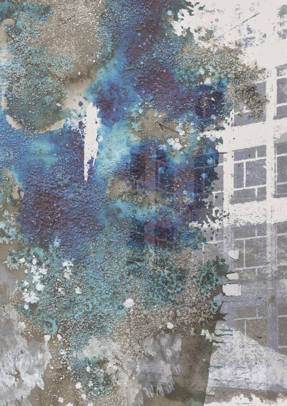
Taking the projector photographs from the self-initiated brief as inspiration, I came up with the idea of working with the word 'Glitch'. Some of my original drawings already had this appearance, which is where the notion came from. My connection to bad luck came from the internal breaking and smashing of phone/laptop/tablet screens. From personal experience, I once dropped my phone which resulted in the bottom of the screen going black along with a glitch half way up the screen. All while my mum had only just left to go on holiday, and with the contract in her name I had no way of getting it fixed or a new phone until she returned. Definitely bad luck!
From my ideas I started on Pinterest and made a new board gathering some ideas, from there I added glitch effects to the photographs I already had. These came out really well and have the damaged and impaired look I was going for.


Using these edited images, I began to create T-shirt designs in Photoshop. Normally my designs are more fashion based and aren’t intended to be particularly literal. However, Threadless competition designs do tend to speak for themselves with no disguised or concealed meaning. Because of this I tried to make the designs literally look like a broken screen, which wasn’t as easy as I originally thought it would be.


Eventually when I got the hang of it I came up with a design I really liked and chose that one to submit. Generally on Threadless people create a 1200 x 1200 pixel document showing the print itself along with an image of it placed on a tshirt. Also, you have to title your design. People come up with quirky and clever names for their tshirts so I decided to go with 'Drop beats, not phones'. Here is the finished design:


Wednesday, 14 January 2015

Locating | Marbling

Marbling turned out really well and I came up with a few possible colour stories. I liked how although I moved the inks the way they spread wasn't down to me and there was a broad range of drawings as a result. 


As marbling is a predicted trend forecast there are a lot of designs out there that include marbling. I want to make my designs different and not just remain a simple marble print. I researched ways in which I could edit them and came across a few collage artists that I've taken a liking to, one of which is Justine Khamara who uses small pieces arranged in interesting and regemented ways. Her circular pieces drew my eye because I could replicate the pattern in order to look like an iris.

I have tried some collaging techniques myself and have gotten a little carried away. I didn't expect the outcome to be so strange or look so weird. However I actually like the obscurity. I have never created something I would consider 'weird but wonderful' so I think it would be a good idea to give it a try. This also gives me the opportunity to work with a lot of colour, which is again something I want to experiment with as in the last unit I struggled with using too many colours at once. Now the plan is to get my drawing scanned in so I can start photoshopping some designs together.


I came across an artist called Piafries on Pinterest this week, and I really like his work. It looks unpredictable and organic, similar to marbling techniques. I especially like his use of colour and virbancy in his work. The colours appear random but also really compliment eachother and so a probably thought about previously.
I attempted to copy his work which didn't turn out as well as I'd hoped. The colours don't bounce off eachother in the way that his do. Although I wont be using the rough acrylic paint marks in my work, I am going to continue to be inspired by Piafries use of colour.


Monday, 10 November 2014

Intentions | Addition of lines and grids

I finally put together my final collection this week based on the most popular designs from the tallys, however when I looked at it all together I just wasn't happy. I like all of the individual designs but when they are put together I'm not seeing a collection that fits together well. This has made me realise that the fashion illustrations and seeing the prints on the product is extremely important, as they can look so different. Thankfully I still have time to make improvements to the prints, so I mind mapped what I thought was wrong so that I can fix the issues. 

I needed some inspiration on what to do so I went on WGSN to look and the Print and Pattern trend forecasts. I noticed a lot of stripes for S/S15. I took inspiration from this and added lines to some of the prints I have already rather than creating all new ones.
I found the most popular design previously was the dress with a white grid pattern over the top of the print, I thought that this might be because the white space creates more of a pattern. I tried experimenting with grids too as it proved popular with my audience.

I feel like the newly added lines break up my designs and make them less similar. Looking at the improved collection, I am much happier with it. It looks a lot more refined and thought about, and each print now is individual to all the rest while at the same time fitting together well as a collection.


Wednesday, 22 October 2014

Intentions | Editing

This week I finally took my drawings into photoshop and began to work on them.
I am pleased with how the designs came out, they aren't final prints but they are a step in the right direction. While editing I realised that all of the designers I have been influenced by such as Mary Katranzou and Chris Kane use digital prints. I considered just producing digitals however there are some physical print processes such as foiling that I want to try and think will be effective on my work. As a result I have decided to create some unfinished digital prints with the purpose of working on them in the print room afterwards.


As well as preparing prints for the print room on Monday I also experimented with the brushes I created from my drawings. Turning them into brushes makes the editing process so easy. Here are a few experimental prints from this week:


Thursday, 2 October 2014

Intentions| Visual Research

I came to a decision on the direction I want to go in for the Intentions Unit. My summer work left off going in the direction of Geometric and futuristic prints which I find really interesting and want to continue. Keeping this in mind, I was drawn to look into the idea of windows - their shape, structure and the idea of reflections. As I used a lot of mirroring in my summer work I think this will link perfectly.
Because my theme for the Unit is Urban Influences I took pictures in the city centre, and have been editing them a little because the originals are dull and in some cases too dark. I have been struggling to come up with a colour palette I like. I have experimented with a few but the colours are random and all over the place, they don't particularly compliment eachother. I feel like once I have chosen a colour palette my drawings will be a lot more successful.
 
 
From my photos I have been using the mirroring app like I did over summer. I have fallen in love with the images that can be recreated through symmetry. I want to base my drawings on the edits rather than the original photos so that they will be more abstract and not so literal. I want to do some line drawings rather than drawings with more depth, I think it will be nice to just have the image in black and white and to keep the structure the main focal point.